


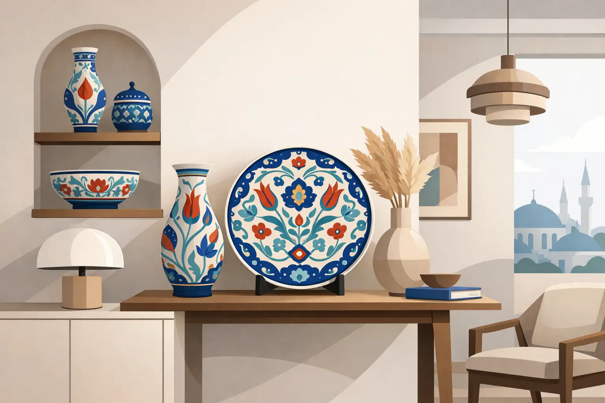
An Iznik fountain on an oak console can change the emotional temperature of a hall. It doesn't need to compete with ten surrounding objects: its design, its enamel, and the imprint of the hand that created it already carry their own conversation. Understanding how to combine modern Ottoman ceramics is precisely about that: giving each piece the space, materials, and light that allow its legacy to be appreciated without turning the home into a themed set.
Ottoman-inspired ceramics have an exceptional quality for contemporary interiors. Their mineral blues, deep greens, warm reds, and botanical motifs bring life to sober architecture. But their strength demands discernment. The key is not to reproduce a historical palace, but to build a modern room where Anatolian tradition meets wood, linen, stone, and clean forms.
Start with the piece that deserves to lead the room
A handmade piece should not enter a room as a filler accessory. Choose a protagonist object and let it determine the rest of the decisions: a large wall fountain, a tall-necked vase, a set of bowls, or decorative tiles. This first choice defines the scale and chromatic pulse of the ambiance.
In a contemporary-lined living room, a modern Ottoman ceramic fountain can occupy the wall above a low sideboard. Place it slightly off-center for a more editorial result, or aligned with a sculptural lamp for a serene and formal composition. Around it, the wall should be kept clean. Craftsmanship gains presence when it doesn't have to push its way through prints, mirrors, and unrelated objects.
On a dining table, the prominence can be more intimate. A fruit bowl of hand-painted ceramic, accompanied by pomegranates, lemons, or quinces, creates a lively and natural centerpiece. There's no need to add candles, flowers, patterned napkins, and candelabras all at once. Well-understood abundance comes from materials, not accumulation.
How to combine modern Ottoman ceramics with color
Color is where many interiors become predictable or excessive. Ottoman ceramics do not need to be matched tone for tone. In fact, copying its blue in cushions, rugs, curtains, and paint often detracts from its sophistication. It is preferable to work with chromatic echoes, not duplications.
Chalky, off-white, sand, stone gray, and tobacco beige backgrounds allow the glazes to shine naturally. On them, cobalt blue acquires depth and turquoise retains its freshness. If the piece contains coral red or garnet, introduce that nuance in a single secondary note: the trim of a linen cushion, a dyed lamp shade, or a seasonal bloom. A discreet repetition is enough for the room to feel thoughtfully designed.
More daring interiors can embrace olive green, smoke blue, or muted terracotta walls. Here the rule changes: choose ceramics with clear contrast so they don't disappear into the background. A milky white and intense blue plate stands out against an olive wall; a piece with reddish flowers takes on an almost jewel-like presence against a grayish blue. The result should feel enveloping, never literal.
Temperature also matters. The blues and greens of Iznik tradition coexist extraordinarily well with honey woods, aged brass, and Anatolian copper. In contrast, next to bright chrome, cold plastics, or unnuanced bluish grays, they can lose their warmth. It's not an absolute prohibition, but it requires very refined architecture and a more restrained selection.
The 70-20-10 ratio, without rigidity
As a starting point, reserve approximately 70% of the room for neutral tones, 20% for supporting materials and colors, and 10% for the ornamental accent of the ceramics. This proportion prevents the pattern from dominating every surface. However, a white kitchen with a handcrafted tile backsplash is a happy exception: there, ceramics can occupy more space because they serve an architectural, not just a decorative, function.
Materials that add depth without overshadowing
The best companion for a modern Ottoman piece is materials that age well. A walnut table, a natural stone countertop, a washed linen tablecloth, or a hammered copper tray share a tactile truth with it. These are surfaces that softly reflect light and accept irregularity as a sign of quality.
Linen is especially useful in the dining room, bedroom, and bathroom. Its slightly imperfect weave balances the shine of the enamel and prevents the composition from looking too ceremonial. On a table, try an oat-colored linen runner under a decorative fountain; in a bathroom, place a small bowl next to dense white towels and an amber glass dispenser. These are simple gestures, but they build ritual.
Dark wood adds gravity, while light oak and chestnut create a brighter, more Mediterranean feel. Marble, on the other hand, works very well in precise doses: a tray on a countertop or a sink with a handmade soap dish. If too much polished stone is combined with too much shiny porcelain, the room can become cold. Compensate with vegetable fibers, linen curtains, or a muted kilim rug.
Find the balance between pattern and calm
The most common mistake is to think that a patterned ceramic calls for more pattern. In reality, it calls for visual silence. If the object has tulips, carnations, palmettes, or delicate geometries, allow nearby textiles to be plain or barely textured. A kilim rug can coexist with it, yes, but it should share a contained palette and not exactly reproduce the same motif.
Mixing works when there is a clear hierarchy. Imagine a living room with a blue fountain on the sideboard, an ivory-based kilim rug, and a pair of plain cushions in sage green. Each element speaks a related language, but none repeats the other's phrase. What others call decoration, here becomes a composition with memory.
In small spaces, reduce the scale, not the ambition. A set of two stacked bowls on a shelf, a small tray on a side table, or a vase on the windowsill are enough to introduce character. A large collection in a narrow bathroom or a dark hallway can feel heavy, however valuable the pieces may be.
Use light as part of the composition
Glazed ceramics change with the hours. The side light from a window reveals brushstrokes, small variations in the glaze, and the relief of its contours. Therefore, a fountain or vase deserves to be placed near indirect natural light, but not under intense sun for hours if it is a delicate or antique piece.
At night, choose warm, directed lighting. A table lamp with a linen shade, placed slightly lower than the piece, will give the enamel depth without creating harsh reflections. Very white ceiling lights often flatten colors and harden the scene. Craftsmanship does not need a display case; it needs light that invites closeness.
Think about real uses, not permanent still lifes
Domestic sophistication is not about having untouchable objects. A fountain can receive seasonal fruit, bowls can accompany an appetizer, and a jug can hold olive branches or garden flowers. Everyday use adds an emotional patina that no perfect composition can achieve on its own.
Still, it is important to distinguish between decorative pieces and pieces suitable for food or liquids. Handcrafted finishes can vary, and an ornamental piece deserves different care than everyday tableware. Always consult its specific instructions and avoid sudden temperature changes, aggressive dishwashers, or abrasive products when the glaze or paint discourages it.
The most elegant house is not the one that looks newly installed, but the one that reveals choices sustained over time. Let a modern Ottoman ceramic dialogue with the table where you celebrate, the entrance that welcomes you, and the light of a slow afternoon. That's where a piece stops being a beautiful object and begins to be part of your story.


