


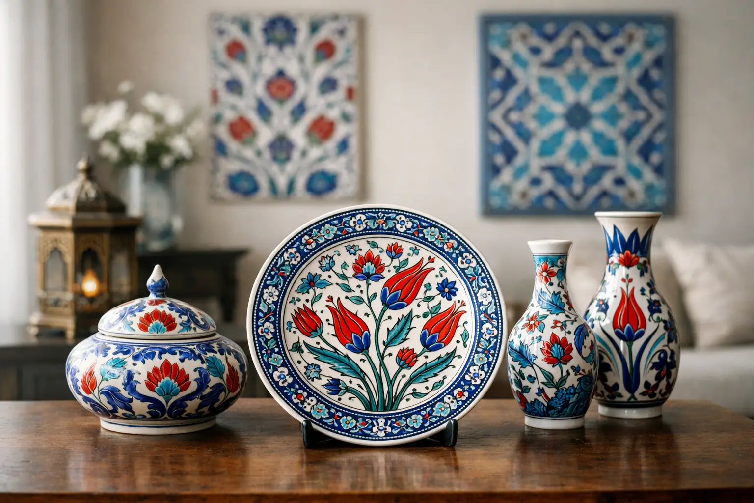
There is a particular kind of blue that changes a room before anyone has even sat down. It appears on a wall plate, the rim of a bowl, the curve of a vase, and suddenly the space feels more collected, more travelled, more alive. If you are wondering cómo decorar con cerámica iznik, the answer begins there - with restraint, with placement, and with an understanding that these pieces carry history as much as pattern.
Iznik ceramics are not decorative fillers. Their visual language was shaped by Ottoman court taste, floral symbolism, architectural rhythm, and an extraordinary command of pigment. That is why they can elevate a home so effortlessly, but also why they deserve a more thoughtful approach than simply scattering a few patterned pieces across a shelf. The goal is not to make a room feel themed. It is to let craftsmanship become part of the atmosphere.
Cómo decorar con cerámica iznik sin recargar el espacio
The first instinct is often to treat Iznik as an accent, but in truth it behaves more like jewellery in an interior. One exceptional piece can do more than six smaller ones. A large charger on a limestone wall, a pair of floral vases on a console, or a deep cobalt bowl centred on a dining table each creates a focal point with quiet authority.
This matters because Iznik decoration is already richly articulated. The tulips, saz leaves, carnations and arabesques have movement, contrast and symbolism built into them. When too many motifs compete in the same sightline, the eye loses the pleasure of distinction. A calmer backdrop allows the ceramic to speak in its own register.
Neutral plaster walls, oak, walnut, marble, unlacquered brass and natural linen are especially sympathetic companions. These materials soften the brilliance of the glaze and stop the room slipping into something overly formal. If your interior already contains pattern - on rugs, upholstery or wallpaper - choose simpler Iznik forms with more negative space or a tighter palette. If the room is pared back, a more intricate piece can carry the composition beautifully.
Start with the room that welcomes ritual
Iznik ceramics come into their own in spaces where daily life has a rhythm: the dining room, kitchen, entrance hall and garden room. These are settings where objects are seen repeatedly and appreciated slowly.
In a kitchen, a small arrangement of plates above a stone splashback or on open shelving brings colour without disturbing function. The key is to avoid clutter. Two or three pieces, thoughtfully scaled, feel intentional. Ten can feel like stock. If the cabinetry is painted in chalky white, olive, putty or soft blue-grey, the traditional cobalt and turquoise tones gain real depth.
In a dining room, Iznik is at its most seductive. A footed bowl filled with lemons or figs introduces both abundance and restraint. A lidded jar on a sideboard gives height and silhouette. Even a single serving piece can shift an entire tablescape away from the ordinary and towards something quietly ceremonial.
Entrance halls are another natural setting. They benefit from objects with presence, and Iznik has it. A statement vase on a pedestal table or a decorative dish placed where keys and correspondence might otherwise gather creates a more polished first impression. It suggests that the home has been considered, not merely furnished.
How to layer Iznik with a Mediterranean interior
For homes shaped by a Mediterranean sensibility, Iznik feels remarkably at ease. The connection is not literal but tonal. Sun-washed walls, organic textures, sea-toned textiles and hand-finished surfaces all complement the clarity and luminosity of traditional Turkish ceramics.
The most successful rooms usually build on shared qualities rather than matching motifs. Think texture beside glaze, chalky surfaces beside crisp pattern, and generous natural light catching the shine of porcelain. A rattan chair, a travertine console, gauzy linen curtains and one finely painted Iznik plate can feel far more luxurious than a room full of overt references.
Blue is often the bridge. Yet not every blue works equally well. Marine, ink, turquoise and softened teal sit naturally beside Iznik decoration. Very synthetic or icy tones can make the ceramic look flatter than it is. Likewise, earthy reds and terracotta can draw out the warmth in classic floral designs, particularly if used in modest doses through cushions, table linen or pottery.
There is, however, a useful trade-off to keep in mind. If your space leans heavily coastal, too much blue-and-white ceramic can tip it into predictability. In that case, introduce pieces with touches of coral red or leafy green, or pair Iznik with warmer woods and antique brass so the scheme retains depth.
Wall display or tabletop presence?
People often ask whether Iznik is better hung or styled on surfaces. The honest answer is that it depends on the piece and on the room's architecture.
Wall-mounted plates and chargers work especially well in transitional spaces, above fireplaces, in kitchens and along stairwells where vertical interest matters. The arrangement should feel architectural rather than random. Odd numbers usually help, and spacing matters as much as the plates themselves. Give each piece enough room to breathe so its line and pattern can be appreciated.
On tables and consoles, the effect is more intimate. Bowls, jars and vases invite nearness. You notice the hand-painted brushwork, the slight irregularity that proves the presence of the maker, the way the glaze responds to light at different hours of the day. This is often the more luxurious approach because it allows the ceramic to be lived with rather than simply observed.
If you are deciding between the two, ask what the room lacks. If it needs structure, go to the wall. If it needs warmth and tactility, style the piece on a surface where it can anchor a vignette.
Cómo decorar con cerámica iznik en salones y dormitorios
Living rooms benefit from Iznik when it is used to punctuate softness. A room filled with upholstery, books and textiles can sometimes feel visually low. A ceramic lamp base, a bowl on a coffee table, or a pair of decorative plates above a chimney breast introduces lift and contrast.
The mistake to avoid is over-distribution. Not every shelf requires a ceramic object. Concentrate the effect in one or two places. A salon should feel layered, not busy.
Bedrooms ask for even more delicacy. Here, Iznik works best in smaller gestures: a lidded trinket dish on a bedside table, a graceful vase with a few branches, or a single plate propped on a chest of drawers. The room should still feel restful. Rich pattern belongs, but in lower volume.
This is where provenance becomes especially powerful. An artisan ceramic in a bedroom does not read as display for display's sake. It reads as a personal choice, something collected because it carries meaning. That emotional register matters in private spaces.
Pairing old and new without losing authenticity
One of the loveliest qualities of Iznik-style ceramics is that they can sit inside both classic and contemporary interiors. In a more traditional home, they reinforce a sense of continuity and cultivated taste. In a modern setting, they interrupt minimalism with soul.
The balancing act lies in what surrounds them. If your room is highly contemporary, choose fewer pieces and let their decorative richness provide the contrast. Against clean-lined furniture and quiet materials, one heirloom-quality ceramic can feel almost sculptural. Casa Serena Interiores understands this balance well: heritage works best when it is curated, not crowded.
In a more historic interior, avoid making every object equally ornate. Let carved wood, antique mirrors or patterned rugs share the stage, but not compete for it. Iznik should feel like part of a collected life, not an isolated statement imported for effect.
What makes a piece feel truly luxurious
Luxury in ceramics is not only about symmetry or polish. It is also about character. The depth of the glaze, the confidence of the hand-painting, the refinement of the border, the density of the pigment and the harmony of the composition all matter. So does the feeling that the object came from a tradition, not a trend cycle.
That is why authenticity matters when decorating with Iznik influence. Pieces inspired by this heritage should still honour its visual discipline and artisanal integrity. A rushed imitation may deliver colour, but it rarely delivers presence.
When choosing a piece, look for one that holds your attention longer than a passing glance. Good ceramic does that. It reveals more over time - the rhythm of petals, the tension between cobalt and white, the quiet drama of a curved form against a plain wall.
A home becomes memorable through such choices. Not louder, just more exacting. More intimate. More sure of itself.
If you are bringing Iznik into your interior, let it arrive with purpose. Give it space, give it light, and let it carry the beauty of its lineage into the everyday.


